Post-run Plots
Purpose
Post-run plots show runner linear term contributions. They answer the narrower question: what is each design-matrix column multiplied by its posterior mean coefficient, and how does that quantity vary over time? They are not the mapping/reference-point decomposition returned by interactive decomp().
In the active development runner, these files are emitted under 30_post_run/ when the output flags are enabled and the fitted model supports runner contribution tables. Hierarchical models, models with offsets, and models fitted with probabilistic media transforms are rejected deliberately. The runner records deterministic skip rows in 40_diagnostics/artifact_status.csv.
Plot catalogue
| Filename | What it shows | Conditions |
|---|---|---|
decomp_predictor_impact.png |
Total contribution per model term (bar chart) | outputs.save_decomp_png: true and successful decomposition tables |
decomp_timeseries.png |
Stacked media channel contribution over time | outputs.save_decomp_png: true, successful decomposition tables, and at least one media term |
Predictor impact
Filename: decomp_predictor_impact.png
What it shows
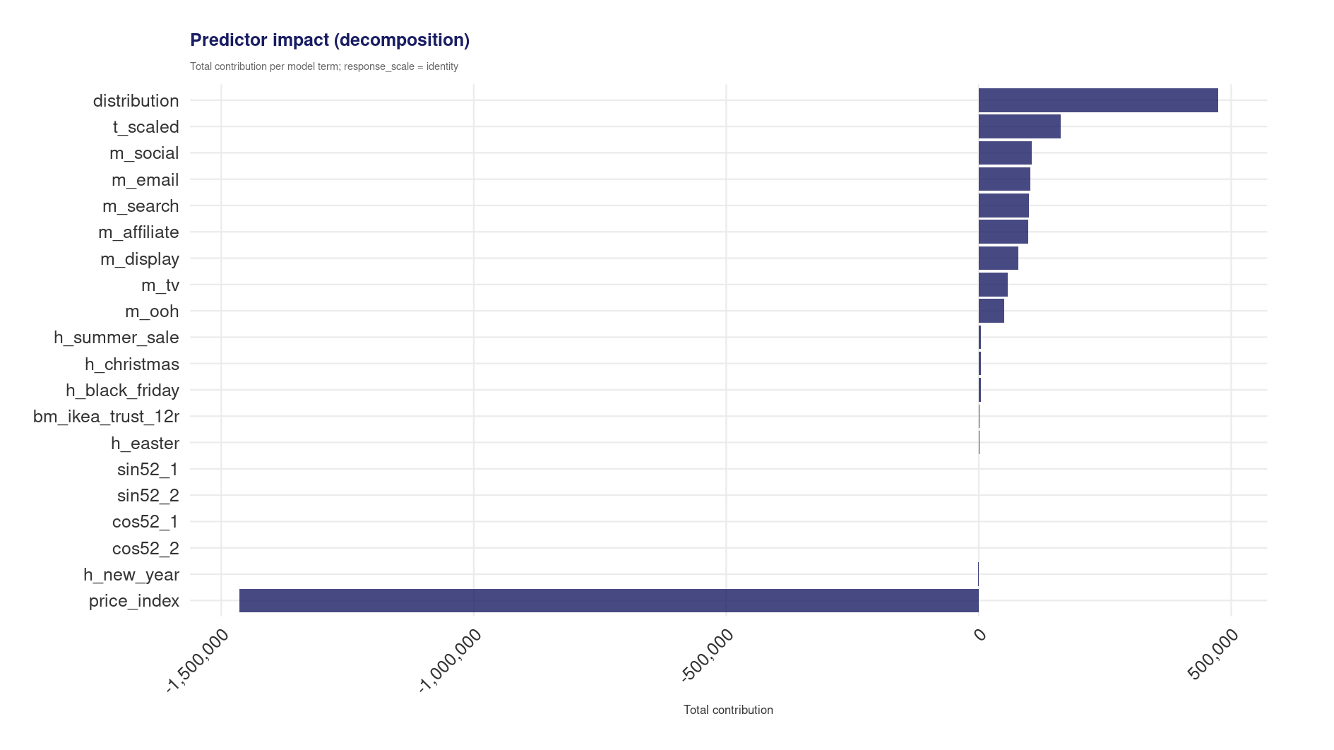
A horizontal bar chart of the total contribution of each model term to the response, computed as the sum of coefficient × design-matrix column across all observations. Terms are sorted by absolute contribution magnitude. The intercept and total rows are excluded.
When it is generated
Generation requires runner_response_decomposition_tables() to return a valid predictor-level summary table and outputs.save_decomp_png: true. This is limited to supported BLM and pooled models without offsets or fitted probabilistic media transforms. The model must retain the original data required by stats::model.matrix().
How to interpret it
The bar lengths represent total modelled impact over the data period. Media channels with large positive bars drove the most KPI in the model’s account of the data. Control variables (trend, seasonality, holidays) often dominate in absolute terms because they capture baseline demand, this is expected and does not diminish the media findings.
Negative contributions can arise for terms with negative coefficients (e.g. price sensitivity) or for seasonality harmonics where the net effect over the year partially cancels.
Warning signs
- A media channel with negative total contribution: Unless the coefficient is intentionally unconstrained (no lower boundary at zero), a negative contribution suggests the model is absorbing noise or confounding through that channel. Review the posterior forest plot and check whether the coefficient’s credible interval excludes zero.
- Intercept-dominated decomposition (not shown here, but visible in the CSV): If the intercept accounts for >90% of the total, media effects are negligible relative to baseline demand. This may be correct, but it limits the utility of the model for budget allocation.
- Missing plot: If the decomposition failed (logged as a warning), the model type likely does not support direct
model.matrix()decomposition. The CSV companions will also be absent.
Action
Use this plot to prioritise which channels to scrutinise. Cross-reference large contributors with the prior vs posterior plot to confirm they are data-driven rather than prior-driven.
Related artefacts
decomp_predictor_impact.csvis the corresponding tabular output when decomposition artifacts are enabled.posterior_summary.csvin30_post_run/provides the coefficient summary underlying the decomposition.
Decomposition time series
Filename: decomp_timeseries.png
What it shows
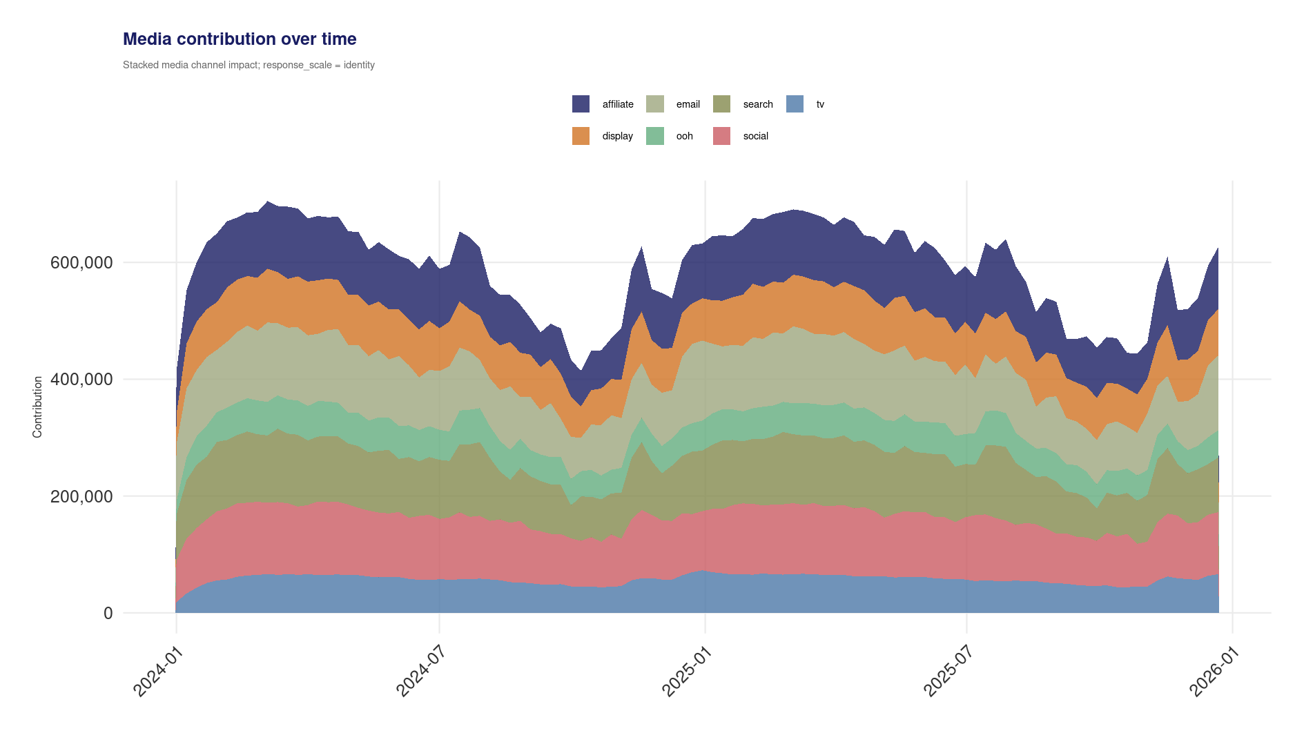
A stacked area chart of media term contributions over time. Each layer is the posterior mean coefficient multiplied by the formula’s design-matrix column. A precomputed transformed column remains precomputed, but the runner does not reproduce DSAMbayes probabilistic adstock or Hill transforms. Non-media terms are excluded.
When it is generated
The plot is generated alongside the predictor impact chart when outputs.save_decomp_png: true and the decomposition tables include at least one media term.
How to interpret it
The height of each band at a given week is that media term’s linear contribution under the fitted model. Patterns reflect the supplied media columns and their fitted coefficients. They reflect adstock carry-over only when the formula column was transformed before fitting. The total height is the aggregate displayed media term contribution; it is not causal attribution.
Warning signs
- A channel with near-zero contribution throughout: The model assigns negligible effect to that channel. This could be correct (low spend, weak signal) or a sign that multicollinearity is suppressing the estimate.
- Implausibly large single-channel dominance: If one channel accounts for the vast majority of the media stack, verify the coefficient is plausible and not inflated by collinearity with a correlated channel.
- Abrupt jumps unrelated to spend changes: Check whether the design matrix term (adstock/saturation output) is well-behaved. Sudden spikes in contribution without corresponding spend changes suggest a data or transform issue.
Action
Compare the relative channel contributions here with the business’s spend allocation. Channels that receive large spend but show small contributions may have diminishing returns or weak effects. This comparison motivates the budget optimisation stage.
Related artefacts
decomp_timeseries.csvis the corresponding long-format output when decomposition artifacts are enabled.
Cross-references
- Model fit plots, posterior estimates that drive the decomposition
- Optimisation plots, budget allocation informed by these contribution estimates
- Plot index